Tim Sutton 23 Nov 2020 // 9:08AM GMT
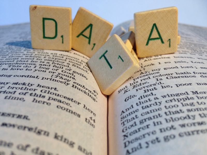
Long ago, they were ‘statistics’. Later: ‘data’. But now: ‘big data’. A faith-based belief system for PR and the broader marketing community. (And incidentally a rare plural noun that seems happier with a singular verb). Data powers insights; drives campaigns; guides us through the maze. From doubt to certainty; directions clearly signposted; questions magicked away.
Well, yes — to a point. But am I the only one to look through recent ‘data-driven’ award entry campaigns who — while admiring their creativity and panache — occasionally wonders at the confident certainty their results claim?
Covid-19 should have been the World Cup finals for big data — a platform on which it would really shine in ‘front of goal’ to a global audience of admiring millions.
Big data has never been bigger or more global. Anyone with Excel can play the many variables to their heart’s content: positive results vs cases, vs deaths, vs tests, per population.
Have so many scientists ever looked at so much global big data with so little resulting consensus on what it means? No need for ‘alternative news’ platforms: the doubts are in plain view.
Scientists disagree — distinguished professors on all sides. Is a positive test a ‘case’? What is the mathematical ratio of positive to false tests? When is a ‘death’ a ‘Covid caused death’? Antibodies vs T Cells: which matter more?
I confess I find this deeply unsettling. I have always adored data or in ‘old language’: ‘facts’. The odder the data, the more beguiled I am. For instance, how many people in India have died from snake bites in the last 20 years? (answer: 1.2 million). How many humans who have ever lived are alive today? (Answer: seven percent).
‘Data, data everywhere but not a drop to think.’ This clever neo-aphorism is first attributed to John Allen Paulus in his 2007 book ‘A Mathematician Plays the Stock Market’, reinventing lines from Coleridge’s Ancient Mariner. It does its job: ironically, it makes you think. What it makes me think is that while big data is here to stay, Covid surely marks the end of its ‘age of innocence’.
In PR, some of us were using (not very ‘big’) data in campaigns back in the late 1980s and early ‘90s. This was well before it became ‘de rigeur’ to include it in the Cannes awards entry.
We all knew, even then, that the opportunity and challenge were never in the data itself. But rather how we selected and described it. In those days, we were all tutored to be ultra-cautious and sceptical about ‘statistics’: they weren’t necessarily ‘wrong’ but we knew to treat them with care. Did that new, innocent, neutral term ‘data’, make us all drop our guard?
Long before the data fog of Covid, we knew some key issues:
-
Data has always been easily ‘politicised’ (as easily as all other information). If beauty lies in the eye of the beholder, data lies in the control and selectivity of the user.
-
It has always been challenging to make a case using data in a balanced and fair way in PR: long before social media. That was true in the days of a generous 6-800 words in a national newspaper. On Twitter now? No chance.
-
In the whole history of science and human achievement, does data ever – by itself – initiate a step change in our knowledge? There may be exceptions. But, sorry Covid experts on all sides, the answer is: rarely. As Karl Popper argued, data is great for either supporting a hypothesis that has been reached by other means (e.g. Einstein’s maths based theory of relativity) or falsifying claims. That is a hugely powerful weapon. But not the same as proving something true.
-
All outputs - data - depends on inputs - questions. They cannot answer questions that should have been asked and were not asked at all. Or asked in a different way. I am indebted to my very good friend, and former Edelman stalwart, David Brain, for this brilliant historic example.
-
Data shines a bright light. Unfortunately, to use a driving analogy, the light more often shines behind, not in front of your car. From economics to pandemics to the forecast of earthquakes, data is wonderful to analyse things that have happened; but it is generally a poor predictive tool. For instance, Google search what Imperial College, London, dominant in informing current UK Government Covid forecasts, confidently predicted in 2009 for the global impact of Swine Flu. Yet they may still be right now: we just do not know.
The idea that data automatically leads to wisdom is pervasive. The data-information-knowledge-wisdom (DIKW) hierarchy seemed like a great idea when first proposed.
But as long ago as 2010, David Weinberger pointed out its failings in the Harvard Business Review: “Knowledge is not a result merely of filtering or algorithms. It results from a far more complex process that is social, goal-driven, contextual, and culturally-bound.”
Data is wonderful, often illuminating, but nearly always tricky. Two things are crucial to understand it: context and assumptions. First: take a context example. I claimed earlier that 1.2 million people have died from snake bites in India in the last 20 years. It’s ‘true’ – meaning it’s the best available estimate according to an authoritative recent study. That would indicate that 164 Indians have died from snake bites in the previous 24 hours before you read this. That certainly shocked me.
But, when translated into a dry mortality rate, that equates to ‘only’ 5 per 1,000 Indians a year, (most of whom are concentrated in a handful of rural states). Does that make me feel better? Hmm, I’m not sure. So, the official Covid mortality rate in India this year (so far) is roughly double that. India is right to focus on Covid – right? Except that the Covid mortality rate is recent and this year only. Whereas snakes have been killing nearly ten times as many Indians over the last 20 years and, presumably, will continue to do so, post-Covid. Data may be ‘binary’. But the questions it raises are multi-faceted.
What about ‘data assumptions’? So, to take my other ‘fact’, is it indeed true that seven per cent of the people who have ever lived are alive today? Maybe. We know, thanks to the transparency and honesty of the experts arriving at this figure that it can be no more than a rough estimate. They admit that there are so many different variables and assumptions in their calculations, that they are far from being certain. It’s a best guess and that’s fine. This is a responsible reporting of data because the assumptions used are entirely open and transparent.
Let’s come closer to home and consider the use of data by PR agencies. It is amazing and welcome that there are now so many data savvy people in our industry. I have worked with some of them — and admired the work of others from a distance — and they are extremely clever indeed.
Whether digging out astute data based ‘insights’ or background advising clients on prevailing social trends, they are truly wonderful and certainly represent a scientific quantum leap beyond our gut instinct ‘blind guessing’ of just a few years ago. So very good that it almost makes me embarrassed to remember the claimed wisdom of my stumbling advice to clients a decade or more ago.
So far, so good. But I have a bigger issue when data is used as part of a public advocacy campaign. (If you want to claim an award-winning campaign on the back of your data, that equates to advocacy too in my book). On this criterion, the bar must be set much higher. ‘Being clever’ is nowhere good enough. After all, there are very clever people who make fake news too. In every scientific field, you do not publish your findings until they have been properly peer reviewed. That means being totally transparent about the process and methodology by which you established your data so that others can check it and verify the claims which you wish to make.
My worry now is hardly original. As long ago as 2011, the PRSA in the United States published a best practices guidance paper on how statistics and data should be used by PR agencies.
It’s a little unfortunate perhaps that the PRSA chose to describe this paper as a ‘Statistics Cheat Sheet’. But let’s forgive that: I don’t think the negative connotation of that word was intended in those innocent days. Some of its language might also seem a little quaint now, but its basic thesis holds up remarkably well today: that how we use and present data is hugely important.
The paper provides a useful reminder of some of the mathematical concepts that we might have forgotten from school: ‘the mean’, ‘the median’; ‘the mode’ and ‘standard deviation’.
It goes on to recommend rules — both practical and ethical — that should govern our presentation of data. Particularly poignant, because it remains such an egregious failing of so much data presented in the media today, is its reminder that there is a distinct difference between correlation and causation.
“Correlation,” (the advice states) “describes the strength of the relationship between two factors or variables. Causation means one thing causes another to happen. Make sure to not use these terms interchangeably and question results that make such claims without support.”
Finally, well before today’s far more sophisticated presentation of data visually via charts and graphs, it put in a prescient plea to “make sure [you] are clear in terms of the main points you are making about the statistics”. Or to bring that advice up to date, I would add: ‘please do not mess around with the integrity and consistency of the ‘x’ and ‘y’ axes on the graph’!
Two things occur to me from this. The PRSA’s paper opened by claiming that “most PR professionals have to deal with statistics frequently, but few have had the technical training to do so with confidence.” At least that was the case in 2011. Is it any different today?
I wish I felt more positive about that. It’s true — and welcome — that every PR agency now has its specialized trained data gurus. But just as politics are too important to be left to politicians, data is too important to be left to data experts alone. Basic data literacy is surely a crucial part of education and training for everyone working in PR. Maybe I am unaware of amazing initiatives going on in some agencies, but I don’t see that data literacy is yet given the importance it deserves.
Second, isn’t it time that, as an industry, we now agreed a ‘data use code of conduct’? The 2011 PRSA advice provides a good starting point, but it badly needs updating to reflect new more complex ‘big data’ realities. Key to me is the issue of ‘transparency’. If you are confident about your advocacy data, be open about it. Publish the raw data you used and make clear what assumptions you made in arriving at your results. Allow others to check it and verify it. A good place to start would be the awards entry.
For all its faults and failings, I still adore data. As long as we pretend to be rational beings, it is a sure rock to which we can cling in an uncertain world.
But if you still feel comfortable using, advising on and claiming results for data that are unclear, unsupported and unproven, there are plenty of great astrology websites out there that might fill your need.
Tim Sutton is former chairman for EMEA and Asia-Pacific at Weber Shandwick.











.jpg)


.tmb-135x100.jpg)

